AVOCADO TOAST INDEX
This is a redesign of the data visualizations in a BBC article that measured housing costs around the world in avocado toast.
The objective of this project was to critically evaluate and revisualize an existing data visualization. While artistically designed, the original visualizations do not allow for easy data comparison or observation of trends. Though simple, a pair of bar charts would most easily allow readers to interpret the data.
Made with: R, ggplot2
Source: BBC

TIL DEATH DO US CHART
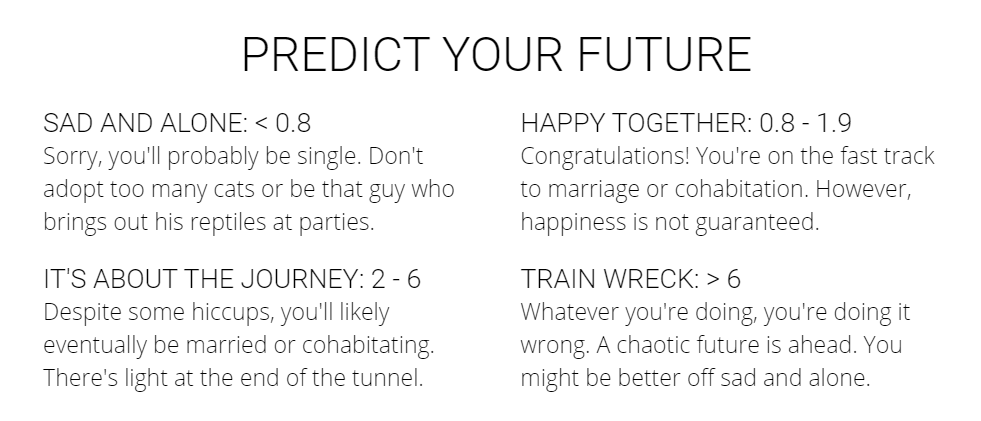
Til Death Do Us Chart is a predictive model developed using machine learning to predict marital status from life events recorded by the National Longitudinal Survey of Youth 1997.
Exploring the depth of this data set's survey questions influenced the decision to create a predictive model. I ran a single linear model on each survey question and used the ten most predictive variables as the basis for the multiple linear regression model used to predict marital status.
Made with: Python, pandas, NumPy, scikit-learn, JavaScript
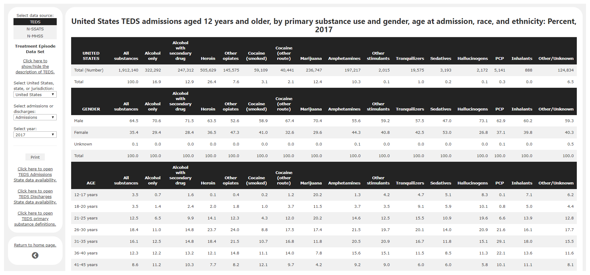
SAMHSA QUICK STATISTICS WEB TABLES
This is a redesign of the Quick Statistics website developed at Eagle Technologies under a contract for the Substance Abuse and Mental Health Services Administration's Behavioral Health Services Information System.
Modernizing the previous Quick Statistics page guided the workflow of this project. This enhanced version utilizes JavaScript and CSS to replace multiple layers of navigation with a single menu bar. After finalizing the layout of the final product, I cleaned, formatted, and separated the concatenated data sets into CSV tables and converted them into HTML tables using AJAX.
Made with: Python, pandas, NumPy, JavaScript, AJAX, jQuery, HTML5/CSS, BootStrap
Source: SAMHSA
WINE REVIEW STUDY
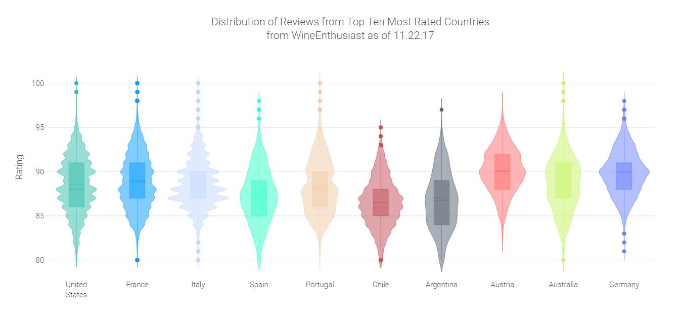
This is a descriptive and sentiment analysis of wine reviews scraped from WineEnthusiast found on Kaggle.
The objective of this analysis was to explore the relationships among: (1) rating points, (2) normalized, weighted composite polarity score of review text, and (3) location of origin.
After brainstorming interesting relationships to visualize and forming hypotheses, I cleaned and prepared the data using Python. Then, I created mock-up visualizations in Plotly.js and evaluated their usefulness. Finally, I applied consistent formatting and color to the series of visualizations before deployment.
Made with: Python, pandas, vaderSentiment, JavaScript, Plotly.js
Source: Kaggle
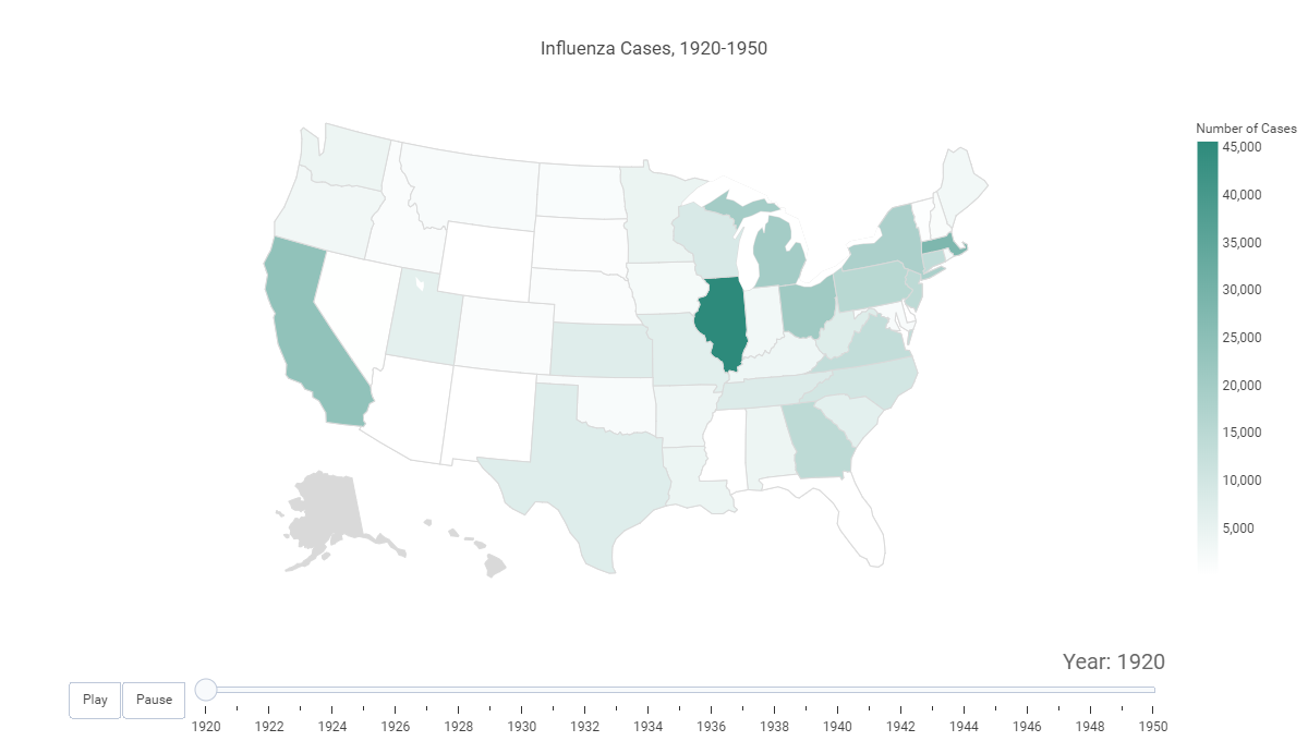
PROJECT TYCHO CHOROPLETHS
This is an exploratory analysis of four infectious diseases in the U.S. over time using data from Project Tycho, a compilation of standardized global datasets of infectious diseases.
The objective of this project was to visualize geographical data over time. I chose four infectious diseases that had a wide range of data among U.S. states over at least ten consecutive years. Then, I cleaned and prepared the data using Python and created mock-up visualizations in Plotly.js. Finally, I applied consistent formatting and color to the choropleths before deployment.
Made with: Python, pandas, JavaScript, Plotly.js
Source: Project Tycho